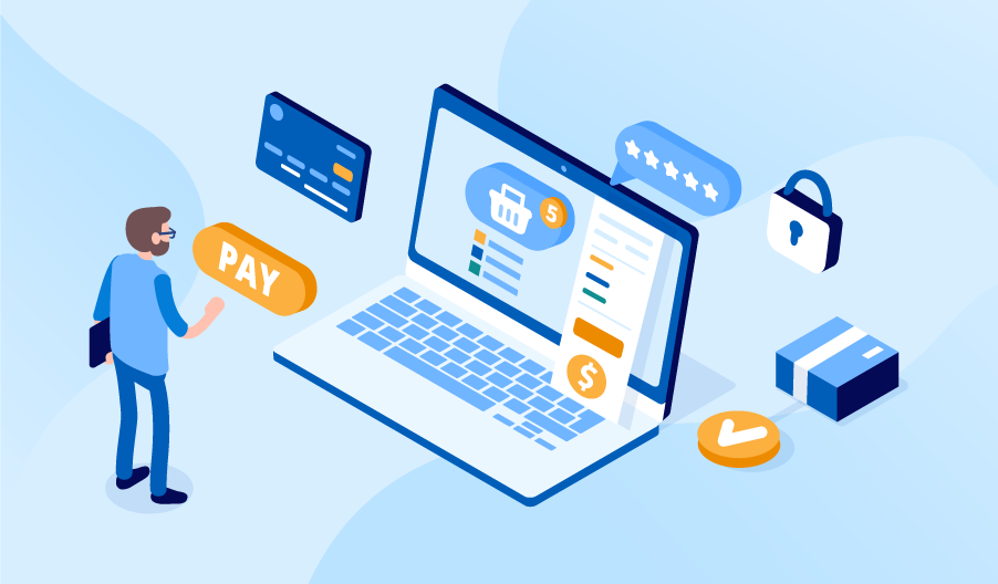
Ecommerce Checkout: Keep It Simple and See Higher Conversion Rates
Editor’s note: In the article, we share tips on how to make ecommerce checkout experience smoother for customers and draft a checkout flow that prevents abandonment. We also encourage you to work with our ecommerce consulting team if you need a closer expert look at your situation.
The reasons are numerous why shoppers often abandon orders at the checkout. Some of them are beyond your control, for example you can’t really influence the behavior of window shoppers. However, you can take care of a few things and make the checkout flow intuitive not to lose customers who do intend to buy.

Why ecommerce checkout matters
Ecommerce checkout is a final step in a digital customer journey. This is when users make a decision to complete the purchase or leave, which is why they tend to doubt a lot if it’s worth spending the money. When it comes to online shopping, any inconvenience or distraction may make users have a second thought and back away. Among the most frequent reasons for checkout abandonment are absence of return guarantees, unexpectedly high shipment cost and cumbersome checkout process.
Checkout flow basics
There is no single right algorithm of creating the perfect UX for the checkout process, but there are some basic rules that will surely increase the success potential of your checkout.
The checkout flow cannot contain fewer than these five information units:
- Total order cost
- Billing information
- Shipping information
- Delivery options
- Payment
Billing and shipping information are often the same, but you can never be sure about that, that’s why you’d better give customers an opportunity to differentiate them. When it comes to paying, people usually have a preferred payment method. Even so, they will appreciate a choice. Besides, the more options you have, the more fish you get in your net.
During their first checkout in your webstore, customers will need to add all the required information. But during their next visits, they will benefit from a faster checkout flow if they have it saved safely in their profile.
5 best practices for ecommerce checkout
Customer comfort is the key to lower checkout abandonment. This short list of ecommerce checkout best practices will illustrate what kind of experience customers expect from you.
- Guest checkout. Don’t require customers to register at your website as it creates additional obstacles on their way to buying an item and makes them feel like they are being pushed. Instead, you can ask them to input their email only as an alternative to registered checkout.
- Mobile optimization. More than half of online shoppers use their smartphones to look for something to buy. Don’t leave this market segment behind and adjust the checkout layout to mobile viewing.
- Security badges. Display security badges on your website to show customers that you value their trust.
- Clear extra costs. Customers expect the total order cost to go higher because of the taxes and shipping, but you still have to be clear about that. Don’t leave these details for last if you don’t want to scare customers away literally a moment before they confirm the payment.
- Validation and error notifications. People can make mistakes while filling in the required forms. Clear and simple instructions for any common input errors will save their time and facilitate your order processing.
Don’t overlook the checkout
Creating converting checkout experience requires more than just page redesign. The checkout success depends much on the groundwork, namely on your ability to map customer journeys and conversion paths. If you feel that your webstore can convert more but don’t know where to start to get a solid optimization strategy, our team will be happy to help your business, just ask!

