Best Practices: How We Fight High Bounce Rate on Ecommerce Homepage
Editor’s note: In the article, Tanya Yablonskaya, Business Analyst at ScienceSoft, will show how to reduce the high bounce rate by improving a single website page. If you decide to implement the ideas described or need a deeper engagement of ecommerce experts, you are welcome to contact ScienceSoft’s team of custom ecommerce developers.
We’ve already shared best practices in building a converting customer journey from the moment of customer acquisition through purchase to delivery. There, we scratched the surface of such a painful issue for ecommerce practitioners as the high bounce rate. Below, I’ll investigate the issue in detail and explain what it has to do with the ecommerce homepage.
Let’s unveil a frequent reason for a high bounce rate
Having gained sufficient expertise for years of ecommerce consulting practice, we at ScienceSoft’s ecommerce team feel confident at fighting the bounce problem on ecommerce websites. Before elaborating on a solution, we make sure to have full visibility into the problem roots. In my practice, I use Funnel Visualization in Google Analytics to map a typical navigation path and trace where visitors tend to land and how many of them proceed to the next step. I won’t pretend to uncover global trends but rather base the following conclusion on the experience of our clients – the homepage is the most frequent landing page and the main traffic leak source.
If you feel that your homepage may be the reason for prevailing one-page visits or the funnel visualization tool has already proved the same, you are very welcome to keep reading. I’m going to recall the two main goals the homepage pursues in ecommerce and outline how to achieve better results in both.

Goal 1. A visual appeal
When landing, visitors unconsciously use the homepage to portray your company’s identity. There your company should try to inspire instant trust and interest – just in a few seconds. Among all the tips we could give you on creating a strong homepage presentation, the two best practices loom large.
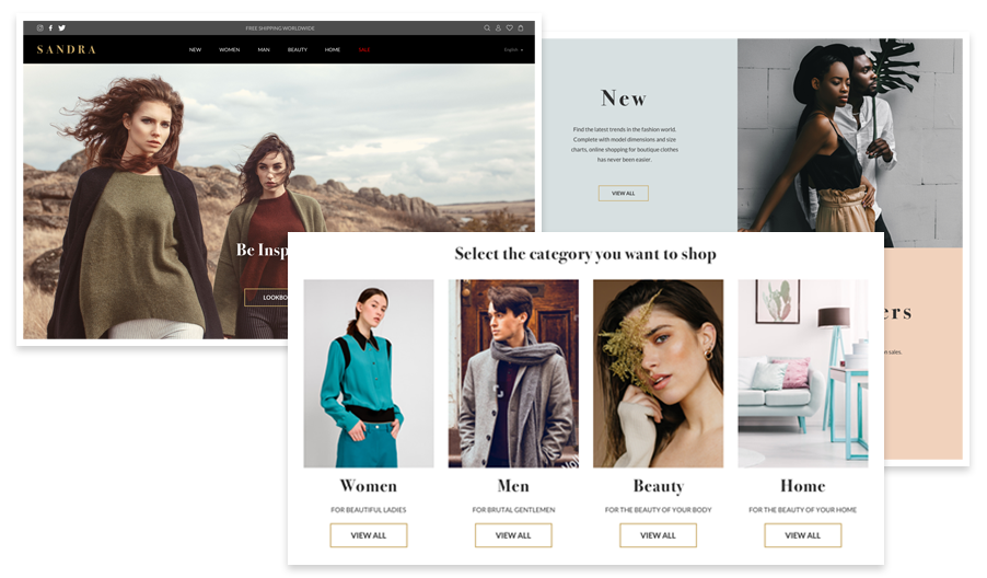
Get professional UI design. We at ScienceSoft take UI design seriously. We start with a discovery phase to look into your products, research the target audience and run a competitive analysis. This allows us to craft the design that presents products favorably, appeals to customers and positions a website ahead of the competition. An elegant, classy and fresh presentation does always work out. Visually, the style we advocate looks as follows:

Promote unique value. I always recommend to ecommerce marketers and now encourage you to create an offering that resonates with your audience and gives them a good reason to buy with you. For a beauty line, this can be the advocacy of ethical beauty, for luxury fashion – in-store events and almost for any retailer – gift wrapping in pre-holiday time. As the second step, make sure that your homepage tells visitors about the gains you offer. You do want to spark their interest, don’t you?
Goal 2. A welcome appeal
We at ScienceSoft have investigated and solved the bounce problem frequently enough to trace one common tendency – this behavioral pattern prevails among first-time visitors. Hence, the homepage best practices we usually employ and recommend to you now are targeted at first-timers.
Make an exclusive first-time shopper offer. Announce the bonus above the folder to make it instantly visible (especially on a mobile homepage). Although I mention this technique as a way to reduce the bounce rate, it can work as a sales booster too. Here are bare facts. For one of our clients, we launched a campaign to increase conversions and, on completing, analyzed the outcomes. It turned out that about 80% of visitors used the first-purchase coupon.
Diversify the ways you present products. As a business analyst, I prove time and again – target audience research results in effective decisions regarding all business aspects, website design among the most evident. One of my favorite techniques to convert visitors on the homepage is to organize products in time-limited collections and, thus, introduce them to the audience in a new engaging way. Here are some ideas:
- Target different customer segments. I offer psychographic segmentation to ecommerce companies to research their customers’ personality traits, values, and lifestyles. This allows ‘tailoring’ products or services to their interests later. For example, one could group specific outfits for different occasions to any segment of their customers or offer complete looks to younger millennials and representatives of Gen Z who haven’t evolved their own style yet and follow suggested trends eagerly.
- Catch price-sensitive customers. Give quick access from the homepage to your current discounts and special offerings and win deal-seekers.
- Prepare for upcoming events. I always stress the impact of seasonality on sales to our clients. When they want to get the most of holiday sales, I offer to collect relevant products in a custom category and promote it on the homepage. As a rule, these are either a collection of gifts or seasonal necessities.
If unbiased, will you convert from your homepage?
With an average bounce rate of 45% in ecommerce, retailers can’t ignore the importance of converting on the homepage. The best practices I’ve outlined can lead to a quick positive effect. But however good conversions you achieve on the homepage, don’t stop there. I can safely say that I’m sharing the opinion of all my colleagues now – ecommerce success is only built through end-to-end customer experience. When mapping a customer journey, we think through each step: from brand discovery to after-sales support and communication. If you’ve already tried one-off improvements on your ecommerce pages, and they didn’t make a major difference in conversions, we can team up to design a customer experience strategy, investigate and improve all points of customer interaction. Don’t hesitate to contact me and my team if you feel interested!

