The Definitive Guide to Ecommerce Website Design
Editor’s note: At ScienceSoft, we’ve amassed considerable knowledge and expertise in ecommerce website design that we are pleased to share. Should you get inspired for your website redesign to win all the benefits we’ll be talking about, you are very welcome to explore our ecommerce web design services and engage our team for the job.
Once you have a competitive product or service and sell it at a reasonable price, the next thing that matters to your ecommerce business success is the customer experience provided. Website design is its vital part as customers interact with your company via the website and often don’t set the two apart. Therefore, a digital experience designed on the website equals your company’s image in the minds of your clients.
More reasons why website design is worth taking seriously
The role of design goes far beyond the website look. Professionally designed, your online store obtains:
- Branding strength. A website is your opportunity to tell customers how your company positions itself on the market and what values or social views it supports.
- Enhanced website usability. Design always starts with the UX part to plan each type of customer interaction within the website. What you win is minimized user efforts whenever is possible and increased meaningful engagement with the site content.
- Technical excellence. Modern websites are responsive to render well on different screen sizes and provide for convenient viewing and shopping experience across devices. Also, they are mostly designed with SEO purposes in mind to support your customer acquisition plans down the road.
- Technology advances. When reasonable, your website design is planned with the latest technologies and approaches in mind (like AR or on-site personalization). Since not all are worth adopting for your business, you should have the ROI of each technology integration estimated to opt for the most rewarding ones.
- Different conversion funnels planned. A classic conversion path leads customers from product discovery directly to online buy. But customers don’t always behave as you expect, so professional web designers plan and map on the website more complicated journeys with half-way conversion points such as:
- Upsells and cross-sells.
- Wish list.
- Email subscription.
- Promotional banners.
- Downloads.
Design elements to add to core ecommerce pages
An ecommerce website may house any number of SKUs and generate any traffic volume – disregarding the size, it always has several typical page types to design.

Homepage. As the most frequent landing page in ecommerce, the homepage pursues a fundamental goal – to entice customers to start a shopping journey. Hence, design elements must:
- Establish a brand identity: brand message, mission statements, trust builders.
- Provide for easy navigation: a properly organized product menu, shortcuts to products with the highest selling potential.
- Trigger immediate interest: promotions and deals, customer service perks.
Read more about homepage design: How we fight high bounce rate on ecommerce homepage
Catalog page. On a catalog page, you don’t only showcase your products – you start selling them. To prompt customers to product discovery, you should:
- Help customers find the products of interest: product filtering.
- Give a quick view possibility.
- Instill product quality: a summarized product rating, a number of product reviews.
- Offer alternatives of further actions: add to shopping cart or wish list, save for later.
Product page. Customers are already interested in your product. It’s high time to take the stress out of the decision-making process and:
- Give comprehensive product information: product description, assembly tutorials, user guides.
- Be illustrative: product images, videos, demos.
- Help to select the right product configuration: a size chart, a size guide, product builders.
- Enhance product credibility: product reviews, social media tags, product labels (‘bestseller’, ‘influencer’s choice’).
- Advertise similar products: cross-sells.
- Offer personal assistance with the product choice: live chat.
Read more about product page design: How to increase conversions with effective product page design
Shopping cart. This page is an intermediate step between a customer’s buying intention and an actual buy. Planning its design, remember to:
- Give a summary of selected products: quantity, parameters, price.
- Outline delivery options and costs.
- Allow customers to edit the order.
- Offer complementary products: upsells.
Read more about shopping cart design: Magento shopping cart – optimization tips for better conversion
Checkout. The best practices in checkout design dictate to:
- Ask for account registration and give an opportunity of guest checkout alike.
- Simplify fill-in forms not to demand much of a customer’s time.
- Offer several payment options.
- Give estimated delivery time depending on the delivery option selected.
- Inform customers about what happens next: you send an email with confirmation details, customers can track the order progress in their personal account.
Read more about checkout design: Magento checkout process: how to convert more
Non-catalog content page. Your content marketing strategy may require diverse content types: a blog, lookbooks, tutorials, deep product dives, interviews, etc. Though designed differently, they all bring you customer engagement and even impulse conversions if you:
- Softly sell your expertise or product value.
- Openly advertise relevant products that fit the information you share.
Check the correlation between sales and website design
It often happens that an ecommerce company follows general design recommendations and invests a lot in customer acquisition marketing, but the conversion rate remains low. So, here is a very important question to answer before giving way to redesign hassle: ‘Does my design hinders sales?’
Given the abundance of interactions throughout a customer life cycle, ways to frustrate customers with poor experience are numerous too – from a consistent shortage of their favorite products to delays in order delivery. In both cases, customers will end up with a competing company. If you suspect design issues, there are several ways to confirm whether they directly impact your sales volume.
Investigate web analytics. If the analysis shows high traffic generated by your SEO efforts and marketing activities, yet a high bounce rate and short dwell time not ending with conversions at any of your planned points, the digital user experience is obviously flawed. Your website design doesn’t inspire trust, and its usability is begging for improvement.
Request an independent design audit. While UI design is largely a matter of subjective opinion, the UX part can be expertly assessed by designers. Upon audit completion, you get a report with UX flaws uncovered and can make a redesign decision deliberately.
Read more about ecommerce audit opportunities: Ecommerce audit – on the guard of your technology and business health
Assess your website experience against web design trends. As for digital user experience and beyond, ecommerce has become truly customer-centric. In website design, trends demand enjoyable experience tailored and convenient for diverse customer groups. Your clients don’t lower their expectations and want from you the same design excellence.
Read more about ecommerce design trends: Ecommerce design trends of 2020 – is your design as customer-centric as it should be?
Where to focus your redesign efforts
Even if you are not up for large investments into full website redesign now, you may apply improvements to certain aspects that won’t go unnoticed by your clients. Here are shortlisted best practices for ecommerce web design.
- Use quality product images, zoom-in, videos, 360-degree views, 3D models.
- Take after a real-life shopping experience with augmented reality.
- Ensure elaborate navigation, filtering and search experience.
- Go for clean and spacious UI with a light background, which resonates with a larger audience.
- Add on-site personalization to serve customers relevant content, promotions and product recommendations.
- Make the website responsive to various screen sizes.
- Don’t break design consistency across the website.
- Avoid visual clutter.
Ecommerce design examples for inspiration
Each product and service line in ecommerce bears its design specifics – some spark designers’ creativity while some demand for a minimalist approach.
LOQ – Fashion website design

Check ScienceSoft’s expertise in fashion ecommerce:
MatchaKari – Food & drinks website design

Check ScienceSoft’s expertise in food & drinks ecommerce:
- Case study: Ecommerce setup for organic food delivery service
- Insights: Selling Food Online – Business and Technology Guide
Olathe Health – Healthcare website design

Check ScienceSoft’s expertise in healthcare ecommerce:
- Insights: 4 faces of healthcare ecommerce and common challenges medical e-business shares
- Insights: Less obvious challenges to selling medical equipment and supply online: be totally prepared
- Insights: How to sell over-the-counter medicine and prescription drugs online – which business path will you take?
- Service: Healthcare website design
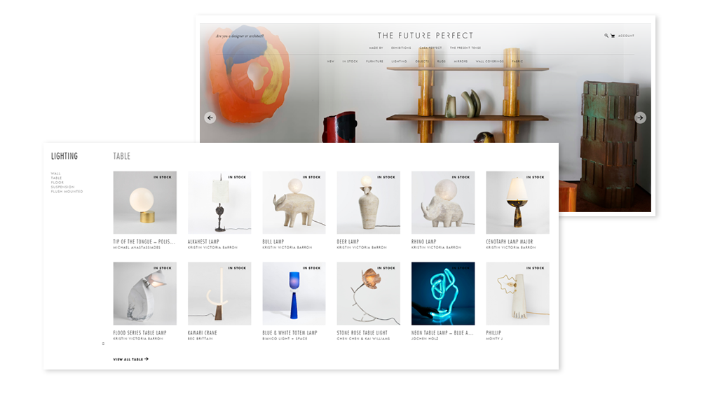
The Future Perfect – Furniture website design

https://www.thefutureperfect.com/
Check ScienceSoft’s expertise in furniture ecommerce:
LifeWise – Pet supplies website design

https://www.lifewisepetfood.com/
Design specifics for B2C and B2B ecommerce
Not only a product line, but your business model also impacts the digital experience to design on a website. Study the highlights of B2C and B2B website design rules below illustrated with interactive demos created by ScienceSoft’s team. Don’t miss to play them in the first place!
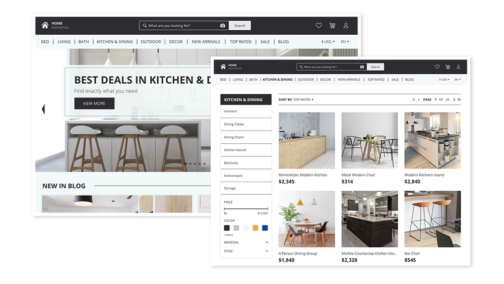
B2C website design – bet big on convenience and personalization
- Personalize website content, promotions and recommended products for customer segments and individuals.
- Encourage impulse buys with content marketing, upsells and cross-sells.
- Facilitate a customer’s search across the website.
- Offer guest checkout.

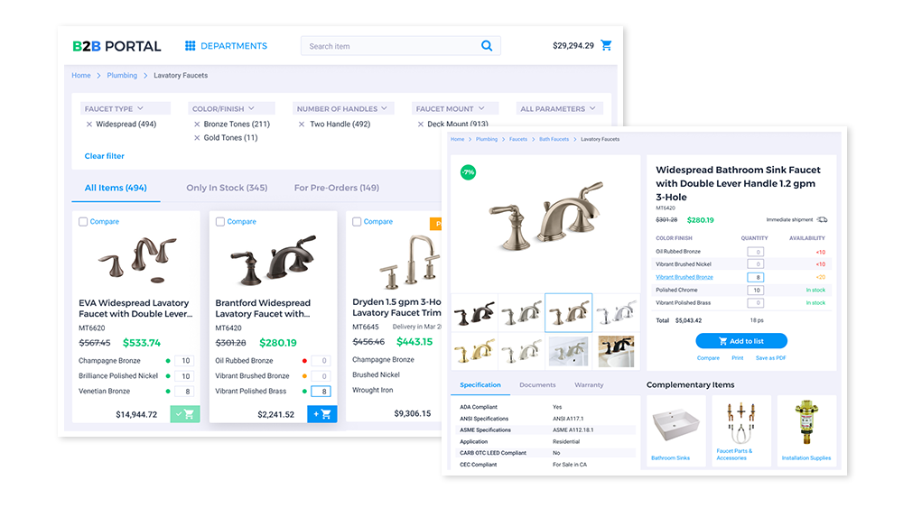
B2B website design – bet big on trust and loyalty-building
- Integrate custom pricing and automated discounting depending on order volume.
- Add a possibility of shipment to multiple addresses.
- Offer flexible payment options (including trade credit).
- Design a comprehensive personal account with role-based management and a quick reorder possibility.

Got inspired for trendy design?
Your website is nothing less than your revenue channel, and the way it is designed largely defines how profitable this channel is. With the ground rules for designing converting ecommerce websites outlined, you will be more informed to shape and communicate your design needs. And if you are looking for a team with a mature approach to web design, you are very welcome to engage our ecommerce web developers for the job.

