Examples of Magento Websites to Win You Over
This article owes much to our professional curiosity as we find it useful to enrich our background in custom Magento development by analyzing the work of other Magento development vendors. We have chosen 5 striking Magento websites and are going to tell you why the customer experience they provide is so good.
#1 Marc Fisher Footwear

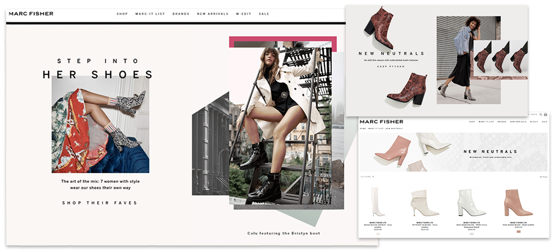
Back in 2005, the company started with a namesake brand Marc Fisher Footwear housed on the Demandware website. Later, they expanded its reach with the acquisition of two more brands. These were supposed to be three independent ventures, but running three independent ecommerce solutions wasn’t part of the plan. So, the company made the right decision to move to Magento 2 and set up a multi-store. As a result, the three Magento sites are administered from a single back end, have similar functionality and different branded looks.
What is great about the websites is the way navigation and product search are organized. There are standard categories in the menu organized by footwear types (heels, flats, sneakers) and custom ones with collections grouped by the latest trends (snake print, minimalist, fur). With such custom product categories, retailers can either promote global trends or, on the contrary, monitor purchasing preferences among their customers and give them quick access to collections they will likely enjoy.
The filter system is also thought through: customers can sort products out by all general and footwear-specific attributes like color, size and width, heel height, product rating, and price.
Via their websites, Marc Fisher Footwear brings enhanced convenience to sales campaigns too. It enables customers to shop for their shoe size directly from a promotional banner, thus eliminating the friction.
#2 Crane Stationery

Here, we meet a manufacturer of luxury paper pieces with a brand history starting in 1801. Having earned their reputation on the quality and exquisite craftsmanship of their works, Crane now serves a wide audience: an extensive retailer community, businesses shopping for branded stationery and individuals valuing the one-of-a-kind approach. Magento 2 happened to make a perfect choice for them to cater to the needs of all. Now, the company has a B2C website and a gated B2B portal built on a single Magento instance.
From their development partners, Crane needed a solution to sell personalized stationery. This personalization possibility is now a signature feature on the website and, we can bet it, a sales booster. For each stationery piece, customers can fill in their personal information, instantly preview the result and order.
Having analyzed the website, we see that Crane shows an intention to bond with customers and bring true value to them. They share storytelling moments in the company history, heritage, and philosophy and talk about the art of stationery etiquette in a blog.
#3 Neverfail Spring Water

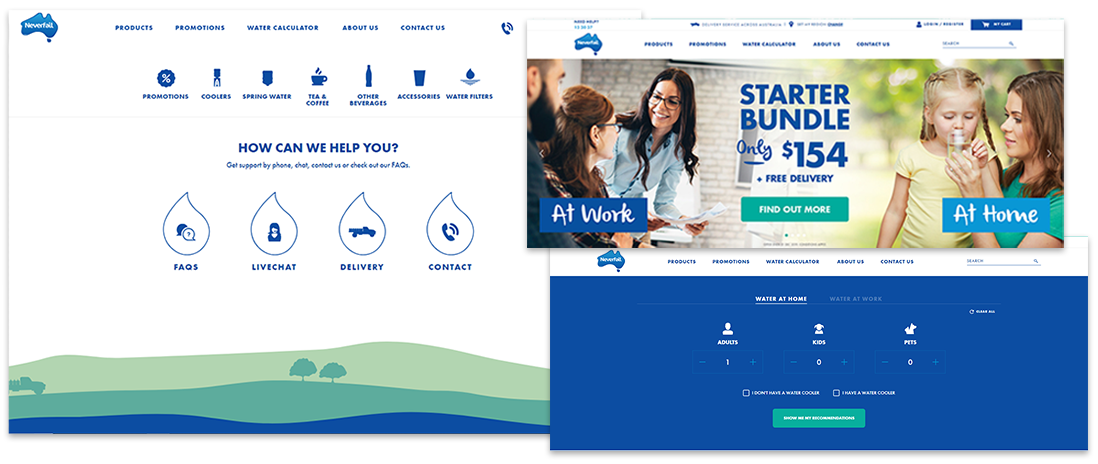
Before migrating to Magento 2, Neverfail Spring Water, an Australian supplier of water and soft drinks, had an outdated website and didn’t provide the experience to buy into. Upon migration, the company delivered on all their improvement ideas and gave a new life to their online commerce.
First of all, leveraging Magento customization capabilities, they custom-built a water calculator for those hesitant about the amount of water they need. Ordering for a family or for work, customers fill in the number of people and get the required volume estimated for them.
To save customers the trouble of frequent reordering, Neverfail adopted one of the current ecommerce trends – a subscription-based model. To subscribe, customers select a product and delivery frequency. Thereafter, they are in full control of their subscription, for example, they can pause the whole order or an individual product for a certain amount of time from the personal account.
The company takes advantage of Magento B2B capabilities to serve their commercial customers conveniently. In their online accounts, the latter can manage multiple locations and set up role-based access.
Neverfail also wins the hearts with their socially conscious attitude. The team is concerned with environmental issues and have a separate section on the website to share how they try to prevent environmental damage within their company: reduce energy and water use, support sustainable use of water resources and produce reusable and recyclable bottles.
#4 Graham & Green

Graham & Green is a classic omnichannel retailer selling furniture in several brick-and-mortar locations and an online store. In 2018, their Magento website got a major update. Like every family-owned business, the company banks on this ‘family’ factor to earn customer trust. They advanced their content management with a blog and behind-the-scenes videos that offer a look inside the team’s life and work processes. Also, in the company history section, they talk about family milestones accompanying the storytelling with photos of family members and artful illustrations.
Graham & Green have generated and implemented several excellent ideas that will be interesting for various businesses. We start with the most prominent one – a custom product configurator. The company offers made-to-order sofas available in several sizes and a whole bunch of fabrics. Customers can try out different combinations, have results visualized instantly and choose the best-suited one.
The company does the very right thing to show furniture items in real interiors. This does not only give customers a clearer picture but also creates upsell opportunities for the seller as they offer related products to complete the look.
A smooth shopping experience in this Magento store is complete with a possibility to join a waiting list – customers can subscribe for out-of-stock items and get an email notification once they are back.
#5 Monin

We saved the ‘delicious’ for the last. The syrup brand Monin decided on Magento from the very start and at some point upgraded from the first version to Magento 2.
The company obviously places a high value on content – it is diverse, valuable and with a commercial touch. The website has several content-oriented sections and covers such content types as how-to videos, tips and techniques, news, trends and more. Here is a pinch of inspiration for online food retailers who still overlook the value of a blog. In theirs, Monin gives recipes and offers to buy ingredients – convenient for customers and profitable for the company.
Monin gives a great example of a comprehensive product page for foodstuffs. For each product, they display its origin, tasting notes, expert tips, applications, and even video recipes. If that doesn’t ensure customer informed choice, we doubt anything will.

