Persuasive B2B Web Design – Earn Trust as a Credible Partner from the First Buying Experience
Editor’s note: In the article, Tanya presents the practices in B2B design that make your online store a trustworthy business partner in the client’s eyes. Draw inspiration from the examples below and discover how you can apply best practices with ScienceSoft’s ecommerce website design service.
The entire B2B ecommerce market enjoys steady growth, having reached $12.2 trillion in gross merchandise volume in 2019 and expected to demonstrate sustained progress in 2020 and beyond. To meet the growing demand for online business-to-business sales, the decision to invest in a website designed specifically to meet the needs of your business clients is a logical step.
The best practices I share here will be useful both for companies who are only embarking on their B2B ecommerce journey and experienced online retailers, as optimized web design can double the conversion rate.

B2B design is not the same as B2C design
A common mistake in B2B web design is to simply copy the elements of a successful B2C website. Resulting B2B websites may turn inefficient, as they neglect the specific behavior of B2B buyers, which is different from that of the B2C audience. For example, B2C customers tend to buy on impulse more often, and the respective goal of B2C web design is to win them over and convert during their first visit.
In its turn, a buying decision in a B2B sales cycle is thoroughly considered but rarely made during the first visit. Thus, the primary task of website design shifts to building credibility. Persuasive B2B design supplies a buyer with extensive information on the products and services provided and guides them through the decision-making process.
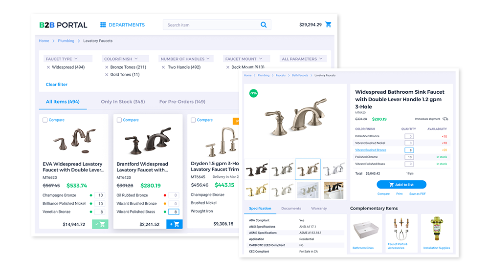
To visualize the kind of customer experience we at ScienceSoft appreciate on B2B ecommerce websites, you are welcome to watch our live demo. You can also get inspired by the best website designs to catch on the best practices and integrate them into your brand vision.

Best practices in B2B design
Here is the list of my favorite design techniques that will help you engage your B2B audience and persuade them to become your clients.
- Informing. As B2B buyers consider a purchase decision more carefully, they need as much information online as possible, including specifications, demos, and social proof examples.
- Guiding and support. When ready for a purchase or having questions, a B2B customer needs a call-to-action (CTA). I advise adding fitting CTAs and not stopping with an email address and a phone number – quick contact forms and live chats can be neatly integrated into your B2B website design.
- Flexibility of orders. Buyers at B2B e-stores often create complex orders that consist of different SKUs varying in amount. Design solutions that allow instantly seeing order volume discounts and choosing different shipment addresses in the checkout process save customers’ time significantly.
- User-friendly interface. Your B2B website should have a neat UI that works towards easy navigation. Clumsy graphic design can make a website less navigable and reduce its loading speed, which inevitably increases customer churn.
B2B website design examples worth your attention
After some theory, I’d like to share the examples of ecommerce and related businesses that managed to make B2B web design a powerful tool to build customers’ trust.
Freska | Tailored offers

Freska is a European company offering cleaning services both to individual consumers and companies. The B2B part of the website features a detailed description of the services, custom prices, and short case studies, ensuring that a customer will be provided with a tailored solution. The Request an Offer form is a clever way to generate leads naturally.
Firefly | Minimalist design

Being moderate in B2B website design is Firefly’s approach. There is only one animated image, which makes a website more dynamic, yet does not reduce the loading speed. The Contact Firefly CTA follows a customer throughout the website and is easily noticeable as it’s the only colored element contrasting with the black-and-white palette of the website.
Slack | Neat placement of calls-to-action

One of the best ways to form an opinion on a product is to try it. Slack’s website gives this opportunity at the very beginning with a corresponding CTA. Once a customer has seen the informational video, advantages, and testimonials, they find this call-to-action again.
Adopt B2B website design best practices with ScienceSoft
B2B customers’ needs are clearly different from those of B2C customers, which also determines their different expectations from buying experience and, hence, your website design. To become a truly credible partner, you’ll need a profound knowledge of your audience. ScienceSoft’s team bases B2B website design on comprehensive audience research, and our experts would be glad to help you in tailoring your B2B design to your business customers’ needs.

