An Illustrated Guide to Furniture Website Design
Editor’s note: Furniture stores need to pay attention to specific elements of their website design to help their buyers in the shopping process. Tanya calls your attention to such elements illustrating them by furniture website design examples, so you can consider adopting them in your store with an experienced ecommerce website design company like ScienceSoft.

Surely, general ecommerce web design rules and trends apply to furniture website design too. Good design incorporates, for example, straightforward navigation, coherent visuals, noticeable calls-to-action and links to customer support channels.
Buying furniture online, however, has its specifics like a careful and thorough choice as furniture is intended for long-term use. As such, customers make a purchasing decision having considered all-round aspects like furniture look, size, durability, materials, assembly specifications, delivery options, the return policy of a seller, to name but a few. Let’s see how to accommodate these specifics in website design.
Essential features of furniture website design
To ensure a high conversion rate, any web store should be designed with the needs of the target audience in mind. If you want to comprehend the full specifics of furniture ecommerce and understand how to win customers in this exact domain, I can recommend an article by my colleague providing in-depth guidance on how to launch and sell furniture online smartly. Below, I’ve shortlisted the essential design practices.
- Create spacious and uncluttered design, which is trendy now.
- At the very least, make filtering by brands and price range.
- Vary content types to present products attractively and rival real-life shopping. Video, 3D visualization, product builders, and assembly tutorials help customers with a choice online.
- Find a way to showcase furniture items in real interiors: with images or AR applications.
- Integrate messengers for customers to easily share and discuss the items they like.
- Take a fresh look at commonplace functionality and start using live chat for a customer experience survey.
- Use lower-priced items as upsells.
Best furniture website design examples
Blu Dot – the superior quality of the photos and navigation on the product page

Blu Dot does a great job with product visuals – high-resolution header pictures across the width of the pages entice buyers, and the detailed photos on the product pages allow them to fully examine the furniture they are interested in.
Plenty of pictures, including big diagrams with product dimensions, and the Design Story section acting like a seller’s blog make the product page truly informative, yet lengthen it. To ensure that a customer can jump directly to the section of their interest, the product page has its own navigation menu.
LexMod – products pictured in room interiors

LexMod has a website with a bright layout and neatly organized product information. The first strong feature of their design approach is showcasing the whole color range of products in interiors, giving a hint to customers as for what palette they match. The second good point is a noticeable icon of a live chat with customer support. It is not intrusive but easily distinguishable on a light background.
Made – a crowdfunding idea

Made has no doubt that their customers know everything before they make a buying decision. Buyers can examine the 3D models of some products with a 360° view option, and every product page includes descriptive product photos and pictograms touching on delivery, dispatch time, return policy, and warranty. For those in search of inspiration, the team collects design tips and ideas in a blog. They monetize it by giving shortcuts to relevant items in each piece.
What sets this furniture brand apart is their crowdfunding initiative to support young designers. There is a separate section on the website, beautifully named Talent Lab, where furniture concepts are presented. Customers may fund the manufacturing and get refunded automatically if the design doesn’t meet the funding goal.
IKEA – well-arranged navigation

IKEA sells furniture, appliances, and home accessories, but this does not lead to complicated navigation. The navigation menu on the website allows a customer to browse furniture by categories or rooms and to see current special deals.
The way to organize product information on product pages is excellent. All product details are arranged into several buttons that open into a corresponding sidebar. This does not intimidate customers with an avalanche of information, yet gives as many details as they need on demand.
Perigold – enhanced shopping possibilities

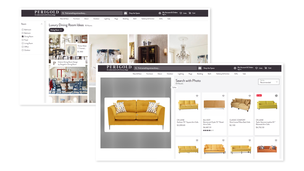
Perigold offers luxury design and provides a shopping experience to match – meeting any possible customer needs with elegant solutions. Inspired by any interior idea, customers can use the Search with Photo option to find items of a similar style on the website. Another possibility to find a suitable piece is the Shop the Space section. It contains a large gallery of room photos where a customer can choose matching products and instantly proceed to purchase.
Design elements don’t work on their own
Good furniture website design follows general ecommerce web design trends but adapts them to the expected behavior and possible expectations of the target shoppers. Even best design practices, like the ones from the above examples, must be carefully assessed to clarify whether they have an impact on customer experience or not in your particular case. If you value a responsible and research-based approach to web design and need such assistance right now, you are welcome to engage our team. You can leave your service request for us right away or start by taking a look at our dedicated interactive demo to assess the ecommerce experience we can create.

