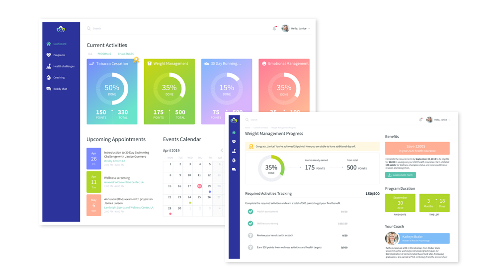
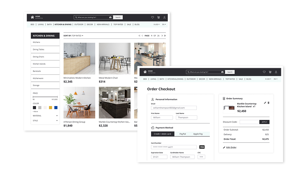
How ScienceSoft Designs Software UI
We are always happy to deliver sleek UI for your software, but we are also ready to go the extra mile and help you build your brand. Our approach to UI design rests on three key principles:
- We always mind the target audience.
- We never sacrifice usability for aesthetics.
- We never go for visually heavy designs.
Traps in Software UI Design ScienceSoft Doesn’t Fall For
Showy design
To demonstrate their talent, UI designers may go over the top and squeeze as much beauty as possible into each user interface. The problem is they forget who they design for. A flamboyant design may be pleasing to a designer’s eye but overwhelming for users.
Inconsistent design
Designers can mix too many styles (of buttons, fonts, colors), which leads to blurred brand identity.
Short-lived design
UI design trends are pretty dynamic, and designers often rush into using them as soon as they are out. Trendy designs, if not underlain with strong brand differentiation, must be refreshed when trends change.
How ScienceSoft Stays Focused on User Experience in UI Design
Our UI designers factor in the demographic and psychographic characteristics of target users and reflect their lifestyle, ethical and cultural values in design.
We always prioritize software usability. With such a mindset, a visual look never poses any risk to user experience but adds aesthetical appeal and personality to the interface. If we suspect any conflicts between our visual ideas and usability, we engage our in-house UX designers and find workarounds.
We avoid creating visually heavy designs when a user’s attention immediately diverges among many eye-catching parts. Generally, we like a balanced approach and play with different design elements to make fewer but more well-grounded emphases.
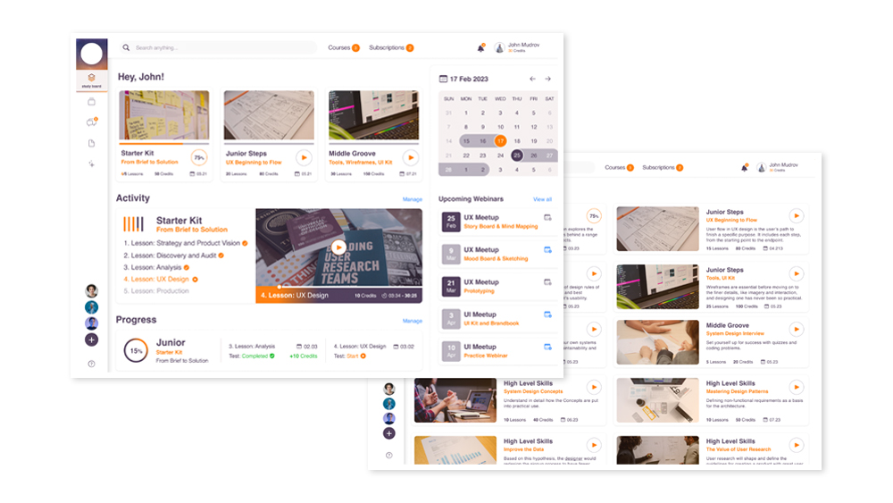
A prototype of a learning management system
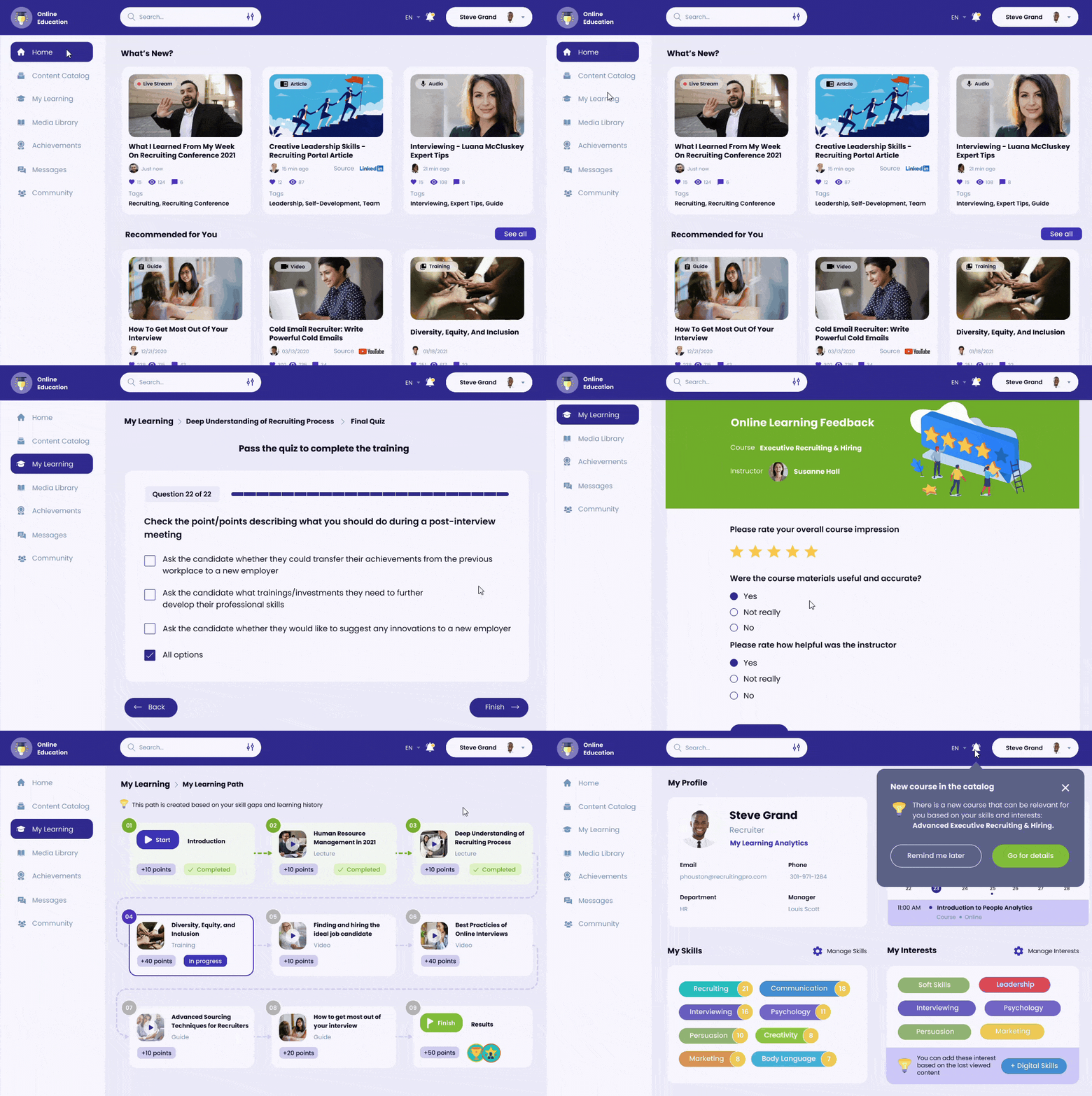
How ScienceSoft Builds a Unique Brand Identity via UI Design
|
|
We offer a full-scale brand consulting service to help companies win the market competition. We do thorough background research to understand our client’s strengths and gaps in competitors’ positioning and unite the two into a unique value proposition. Then, we use UI design as one of the ways to convey the message to the target customers. |
|
|
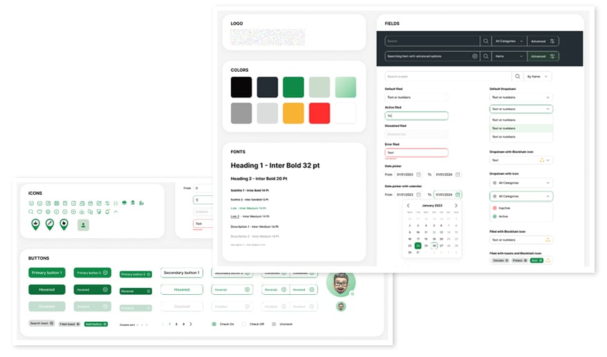
When doing UI design for a company’s digital space, we create a complete UI kit with color palettes, fonts, widgets and other visual elements. The UI kit is a great helper in building a brand identity. In software interface design, we use it to keep the style and branding consistent across different types of pages. While our clients can also follow it to create branded non-digital materials. Example of a UI kit:
|
|
|
When hiring UI designers, everyone looks for creativity and a good eye for beauty. We value these qualities too but pay special attention to the candidates’ soft communication skills. As a result, we have a team of designers with great presentation skills and communicating with clients eagerly to better understand a company’s values and vision. Such close cooperation between clients and designers helps us show brands most vividly via design. |
