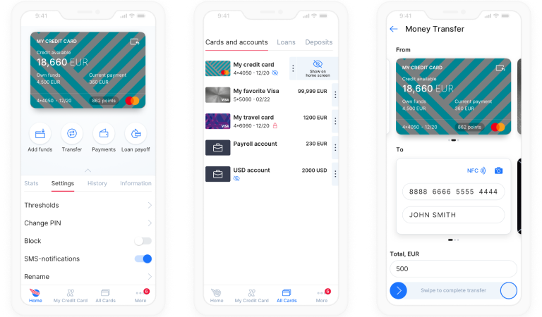
UX and UI Redesign to Drive High CSAT for a Mobile Banking App
About Our Client
The Client is a European bank founded in 1994.
Challenge
The Client’s mobile banking solution was constantly receiving extremely low scores and mostly negative reviews in the app stores. Their customer support group also reported frequent user complaints about the mobile app. In the end, the Client sought professional assistance in increasing user satisfaction with the app.
Solution
ScienceSoft started cooperation with carrying out a thorough audit of the Client’s mobile banking application. The audit revealed that the Client’s mobile application not only had a visually outdated UI but also offered confusing navigation due to an abundance of features. So as to achieve meaningful results, it was decided to redesign the app from scratch, starting with user experience design.
A UX designer and 3 UI design experts worked on the app’s redesign for 2.5 months. The workflow of developing each series of connected screens of the app was as follows:
- The UX designer created interactive wireframes in Axure RP and sent them to the UI design team.
- Using UX wireframes as a base, UI designers created all visual elements in Sketch and built an interactive and colorful prototype in InVision.
- The prototype went through user testing by a special group on the Client’s side.
- Adjustments according to the testing results were made to the prototype until the testing group’s approval.
- All the visual assets of the final prototype with related functional specifications were sent to the Client’s development team via Zeplin.

Results
The fundamental redesign made the new version much easier to navigate. Once the project was finished, the Client requested ScienceSoft’s design competencies for 3 more projects.
Technologies and Tools
Axure RP, Sketch, InVision, Zeplin.

